Have you ever designed something on your computer only to have it look completely different when it's printed? Maybe your bright neon blue turned dull, your vibrant greens lost their punch, or your rich black suddenly looked gray. Don't worry—your printer isn't broken. The culprit is usually the difference between RGB and CMYK color modes.
Understanding how colors work is one of the most important steps in creating print-ready artwork. Knowing the difference between RGB and CMYK can save you time, money, and a lot of frustration.
What is RGB?
RGB stands for Red, Green, and Blue. These are the three colors of light that combine to create every color you see on your phone, tablet, television, and computer screen.
RGB is what's called an "additive color model." This means colors are created by adding light together. The more light that's added, the brighter the colors become. When all three colors are combined at full intensity, they create white.
RGB has a much larger color range than print can reproduce. That's why colors on your screen often appear brighter, more vibrant, and more saturated than they do when printed.
What is CMYK?
CMYK stands for Cyan, Magenta, Yellow, and Key (Black). Unlike RGB, CMYK is a "subtractive color model," meaning colors are created by layering inks that absorb light rather than emit it.
Because printers use physical ink instead of light, they cannot reproduce every color you see on a screen. Certain bright blues, greens, oranges, and neon colors simply don't exist within CMYK's color range.
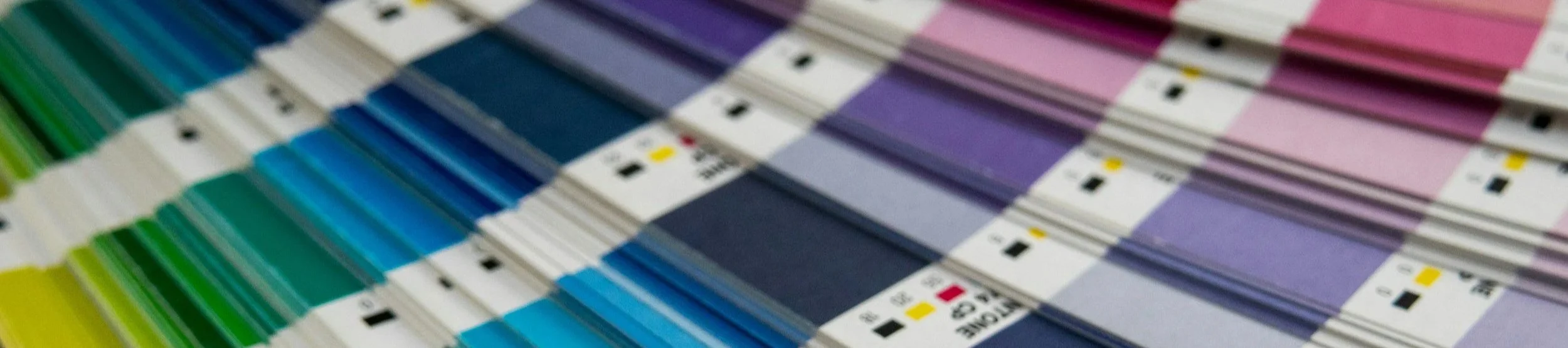
Pantone Swatches
How to Prevent Color Problems
Design in CMYK From the Beginning
If your project is going to be printed, design it in CMYK whenever possible. Programs like Adobe Illustrator, Photoshop, and InDesign allow you to create documents using CMYK color settings.
Starting in CMYK lets you see more realistic colors throughout the design process.
Avoid Extremely Bright Colors
Colors that appear almost fluorescent on screen usually don't translate well to print.
Be cautious with:
Neon greens
Electric blues
Bright oranges
Fluorescent pinks
Highly saturated purples
If it looks like it's glowing on your screen, it probably won't print exactly the same way.
The Bottom Line
RGB and CMYK aren't competing color systems—they simply serve different purposes.
RGB is designed for screens.
CMYK is designed for print.
Colors will almost always look different between the two.
The best way to achieve beautiful printed results is to design with print in mind from the very beginning. Understanding color limitations allows you to make better design choices and avoid unpleasant surprises when your order arrives.
If you've ever wondered why your business cards, banners, or decals didn't look exactly like they did on your computer screen, now you know—it's not magic, it's color science.